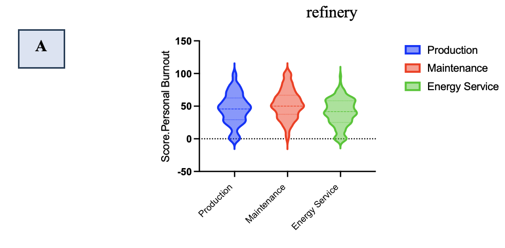
Violin plots are used to visualize the distribution of a single continuous variable. The plot displays the density estimation of the variable’s values, typically with a combination of a kernel density plot and a mirrored histogram. The width of the violin represents the density of data points at different values, with wider sections indicating higher density.


Figure (8)
Figure : Overall, the three types of burnout (A) Score Personal Burnout, (B) Score Work-Related, and (C) Score Client-Related among Karbala refinery departments

